Start with structure, then style
Good menu design begins long before anyone chooses a font. The first job is structure: which categories you have, what order they go in, how many dishes each holds and which dishes deserve attention. A beautiful layout cannot rescue a menu with fourteen near-identical curries or a drinks list scattered across three pages. Get the content and the order right on a plain document first, then design around it.
Think about how guests use the menu in your room. In a quick-service cafe, people stand at a counter and decide in seconds. In a fine-dining restaurant, a couple may spend ten minutes reading every line. A hotel breakfast menu is scanned by sleepy people looking for eggs and coffee. Each situation calls for different density, length and emphasis, and the design should serve the decision guests are trying to make.
Finally, decide what the menu needs to achieve for the business. If menu engineering has shown you a few profitable dishes that deserve more orders, the layout is one of your strongest tools for promoting them. If service speed matters most, the layout should help guests decide quickly. Write those goals down, because they will settle many design arguments later.
Choose categories and put them in a sensible order
Categories are the map guests use to find their way. Most menus work best with somewhere between four and eight top-level categories, each with a name a guest recognizes at a glance. Too few categories create long, undifferentiated lists; too many force guests to jump around and make the menu feel bigger than it is. Group dishes by how guests choose, not by how your kitchen stations are organized.
Within each category, order matters too. Put the dishes you most want to sell near the top, where attention is highest, and avoid ordering by price from cheapest to most expensive, which turns the list into a price comparison. A vegetarian, vegan or gluten-free option should be easy to find in each relevant category rather than banished to a separate corner, unless your guests prefer a dedicated section.
Order categories the way a meal unfolds
Guests expect a menu to follow the meal: small plates or starters, then mains, then sides, then desserts, with drinks either first or on a separate card. Breakfast menus follow the morning, from coffee and juices to eggs, griddle dishes and pastries. An Indian restaurant might move from chaat and tandoor starters to curries, then breads and rice, then desserts. Breaking the expected order without a good reason makes guests hunt.
Name categories in your guests’ language
Category names should be plain enough that a first-time guest understands them instantly. From the Garden, Land and Sea, or From the Fire can work when the concept supports it, but only if the dishes underneath make the meaning obvious. Avoid internal shorthand such as Hot Line or Section B. On a digital menu, short category names also fit better in a scrolling navigation bar, which keeps them visible on small screens.
How many items each category should hold
Long lists slow decisions. When a category grows beyond about ten items, guests tend to skim, fall back on something familiar or ask the server what is good, and your carefully developed dishes disappear in the middle of the list. A shorter menu also helps the kitchen: fewer dishes mean fewer ingredients, less waste, faster prep and more consistent execution on a busy night.
The ranges below are practical rules of thumb, not fixed laws. A specialist biryani house, a dim sum restaurant or a whisky bar may deliberately carry a long list because breadth is the point. Even then, sub-groups and clear headings make a long list feel manageable. If you are over the range, look at your menu engineering results for dogs you can retire before you add anything new.
| Menu section | Practical range | Why |
|---|---|---|
| Starters and small plates | 5 to 8 | Enough variety for sharing without slowing the first decision |
| Mains | 6 to 10 | Covers the main proteins plus vegetarian choices while keeping prep manageable |
| Sides, breads and extras | 4 to 8 | Supports add-ons without crowding the main choices |
| Desserts | 4 to 6 | Guests decide quickly late in the meal and a short list is easier to say yes to |
| Signature drinks or cocktails | 6 to 10 | Balances spirits and flavor styles; specialist bars may carry more |
How guests actually read a menu
Guests rarely read a menu from top to bottom like a book. They scan for category headings, jump to the section they care about, skim dish names and only then read descriptions for the few dishes that catch their attention. Prices are checked last, or alongside the name for price-sensitive guests. Design for that behavior: make headings easy to find, dish names easy to pick out and descriptions easy to skip.
On a single printed page, the top of each column and the first item in each category get the most attention, and items set apart with space, a thin box or a small illustration stand out from the list around them. On a two-page spread, the area just above the center of the right-hand page is often treated as prime space. On a phone, the first screen and the top of each category matter most.
Use emphasis sparingly. If every second dish is boxed, starred or marked as a chef’s favorite, nothing stands out and the page looks cluttered. One or two highlighted dishes per category is plenty, and they should be dishes you genuinely want guests to order, usually the stars and puzzles from your menu engineering analysis. Review those highlights whenever the menu changes, because a box left around a dish you no longer want to push quietly works against you.
Build a clear visual hierarchy
Hierarchy is the order in which the eye notices things. On a menu, guests should see the category heading first, then the dish name, then the description, then the price. You create that order with size, weight, color, spacing and position. A category heading might be larger and in capitals, a dish name bold, a description in a lighter weight and the price the same size as the description, set close to the dish rather than in a separate column.
Whitespace is part of the hierarchy, not wasted paper. Space between categories tells guests where one section ends and the next begins. Space between dishes makes each one easier to read. Crowded menus look cheaper and make guests work harder, while a menu with breathing room feels calmer and more confident, which suits almost every type of restaurant from a street-food stall to a tasting room.
Keep the visual language consistent. Use one style for every category heading, one for every dish name and one set of dietary markers. Consistency lets guests learn the system on the first page and use it effortlessly everywhere else, including on a separate drinks or dessert card. The same applies across formats: the printed menu, the table tent and the digital menu should share headings, names and markers, even when their layouts differ to suit the medium.
- Limit the menu to two typefaces at most, one for headings and one for everything else.
- Set dish names in a heavier weight than descriptions so guests can skim names quickly.
- Place prices after the description or beside the dish name instead of in a right-aligned column.
- Separate categories with generous space or a thin rule rather than heavy borders.
- Highlight no more than one or two dishes per category with a box, space or small mark.
- Use color for meaning, such as dietary markers, not for decoration on every line.
Typography that works in dim light
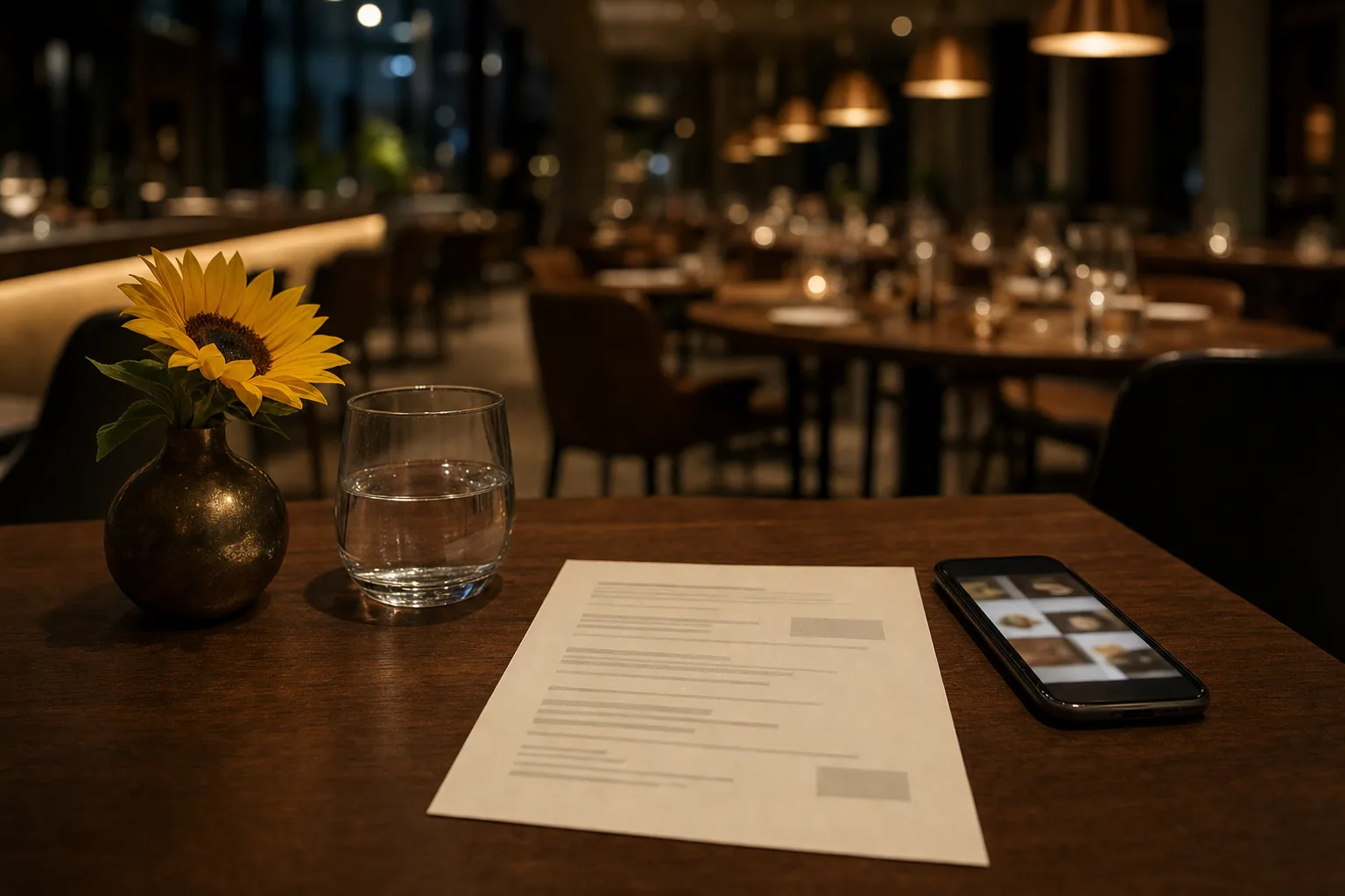
Restaurants are often dimly lit, guests may have forgotten their reading glasses, and a menu might be read at arm’s length across a candle. Typography has to survive those conditions. Choose a clear, well-spaced typeface for descriptions and keep body text large enough to read comfortably; for most printed menus that means at least 11 or 12 points, and larger for menus read at a distance or in low light.
Decorative scripts and condensed display fonts can give a menu character, but use them only for short headings and never for descriptions or prices. Avoid long passages in capitals, which are harder to read than mixed case. Check contrast carefully: thin gray text on cream paper may look elegant on a designer’s screen and become unreadable at a corner table on a Friday night.
Always test a printed proof in the actual dining room, at the actual table, under evening lighting. Ask someone who has not seen the menu to find a vegetarian main and a dessert, and watch where they struggle. Ten minutes of testing catches problems that no amount of screen review will find. Check the paper too: glossy laminate can reflect overhead lights straight into a guest’s eyes, while a matte stock reads far more easily.
Designing digital and mobile menus
A digital menu is read on a phone held in one hand, often while talking to friends, in variable light and on an unpredictable connection. That changes the priorities. A guest sees only a few dishes at a time, so category navigation matters more than on paper; long descriptions push other dishes off the screen; and heavy images can make the menu slow to load on a weak signal.
Design for the narrowest common phone first, then check larger screens. Keep category names short enough to fit a horizontal navigation bar, keep descriptions tight and make sure prices and portion names are clear without tapping. Sold-out dishes should be clearly marked rather than silently present, because a guest who chooses a dish only to hear it is unavailable has a worse experience than one who sees the sold-out label up front.
A digital menu should never be the only option. Some guests have no phone, a flat battery or difficulty scanning a QR code, so keep a printed copy or an ask-staff option available. Print a short, readable web address next to every QR code as a fallback, and brief hosts to offer the printed menu without making the guest feel awkward for asking. Test the whole flow on a guest network or mobile data, not only on the office Wi-Fi.
- Open the menu on a narrow phone screen and check that nothing scrolls sideways.
- Jump between categories using the navigation and confirm each heading is easy to reach.
- Read three dish descriptions and check none of them fill the entire screen.
- Check that prices, portion sizes and dietary markers are visible without extra taps.
- Mark a dish sold out and confirm the label is clear on the guest view.
- Load the menu on a mobile connection and in a dim room to test speed and contrast.
- Ask a colleague who has not seen it to find and choose a dish while you watch.
Make the menu accessible to every guest
An accessible menu is simply a menu more people can use. Guests with low vision, color blindness, dyslexia, limited reading ability or unfamiliarity with your cuisine all benefit from the same choices: strong contrast, generous type, plain language, consistent layout and markers that do not rely on color alone. These choices also help everyone else, from tired parents to guests reading in a dark bar.
For digital menus, follow established web accessibility guidance. The widely used WCAG guidelines recommend a contrast ratio of at least 4.5 to 1 for normal body text. Text should be real text rather than an image of a printed menu, so guests can enlarge it and screen readers can read it aloud. Photos need meaningful alternative text, and buttons and links should be large enough to tap accurately.
- Use dark text on a light background, or the reverse, with strong contrast throughout.
- Pair any color-coded dietary marker with a letter or symbol and a clear key.
- Write descriptions in plain language and explain unfamiliar dish names briefly.
- Avoid publishing a digital menu as a photo or scanned PDF of the printed version.
- Offer a large-print copy and make sure staff can read the menu aloud when asked.
- Keep a printed menu or another alternative available for guests who cannot scan a QR code.
Use photography with restraint
Photos can sell dishes, especially unfamiliar ones, but they can also make a menu look crowded and cheaper. On a printed menu, a photo next to every item tends to suit fast-casual concepts better than fine dining, where a few carefully chosen images, or none at all, usually fit the mood better. On a digital menu, photos are more natural and help guests understand dishes they cannot see on neighboring tables.
If you use photos, quality and honesty matter more than quantity. Every photo should show the dish as it is actually served, with the same portion, garnish and plateware. A professional-looking photo of a dish that arrives looking different invites disappointment. Shoot in soft natural light, keep the backgrounds simple and photograph all dishes in a consistent style so the menu looks like one coherent set.
Start with the dishes that most need explaining or promoting: signature plates, high-margin dishes that are rarely ordered and anything with an unfamiliar name. In Menulo, owners and managers can organize dishes into categories, hide a category that is out of season and add a photo to a dish, so the published menu stays tidy as the offer changes. Replace photos when a dish changes, because an outdated image is just as misleading as an outdated price.
Every photo should show the dish as it is actually served, with the same portion, garnish and plateware.
Frequently asked questions
How many items should be on a restaurant menu?
There is no single right number, but most categories work well with about five to ten items, and many restaurants find that a focused menu improves both decision-making and kitchen consistency. Specialist concepts may carry more items in their core category. If the menu feels long, use your sales records to identify low-selling, low-margin dishes to retire before adding new ones.
Where should the most profitable dishes go on a menu?
Place them where attention is highest: at the top of a category, first in a column, or set apart with whitespace or a subtle box. On a phone, the first screen and the top of each category matter most. Highlight only one or two dishes per category, and check your POS or sales records after the change to confirm the placement actually helped.
What font size should a menu use?
For most printed menus, descriptions should be at least 11 or 12 points, with dish names and headings larger. Go bigger if the menu is read at a distance, in low light or by an older audience. Use a clear typeface for body text, avoid long passages in capitals and decorative scripts, and always test a printed proof in your actual dining light.
Should a digital menu look the same as the printed menu?
It should share the same structure, dish names, prices and voice, but not the same layout. A phone shows only a few dishes at once, so digital menus need short category names, easy navigation, tighter descriptions and clear sold-out labels. Avoid publishing a scanned image or PDF of the printed menu, which is hard to read, slow to load and inaccessible to screen readers.
Should restaurant menus have photos?
It depends on your concept and format. Digital menus benefit from good photos, especially for unfamiliar dishes. On printed menus, many full-service restaurants use few or no photos to keep the page calm. Whatever you choose, use real photos of the dish as served, in a consistent style, and start with the dishes that most need explaining or promoting.
- #menulayout
- #menudesign
- #digitalmenudesign
- #menutypography
- #menuaccessibility